

Queer Futurities
Georgia Tooke - 23rd June 2022
This is a show I’ve been patiently waiting for; for as long as I knew about it but really for so much longer than I consciously realized. This show is not only acknowledging what queerness meant and examining what queerness means now, but imagining what it could mean. What does it mean to create a thoughtful, caring, compassionate world through the lens of queerness?
I had unfortunately missed opening night because of work but heard it was amazing. Gone was the typical stuffiness of normal gallery openings, where visitors meander around rubbing elbows with familiar art folk while sipping cheap wine out of tiny plastic glasses. That was, I guess how the evening began but was quickly transformed as one of the artists, Edzi’u, began their performance piece. I heard that people were mesmerized into a stunned silence which lingered even as the performance concluded. Later during the opening, the room darkened and soft coloured lights lit the room as a DJ started up and everyone danced together among the works that surrounded them. I wasn’t there, so why am I telling you this? I guess I feel like it’s relevant to the tone of the whole theme of this show - breaking age-old institutional structures and inviting community, collaboration and creative space-making. While I’ll be writing about Queer Futurities: holding area, there’s also another avenue that curator Dani Neira is exploring titled Queer Futurities: gathering place, which will feature workshops, skill-sharing and performances sprinkled throughout the duration of the exhibition.
*Note to reader: if you are reading this before July 23rd check out the Open Space website here to find out what’s next for Queer Futurities: gathering place.
Queer Futurities: holding area features work from 9 artists and showcased a rich variety of mediums including hard & soft sculptures, extended painting, video (both on a monitor & two-channel projection installation) which created an intriguing flow through the gallery space. I’ve been debating for quite some time now as to whether or not to write about every work in depth… I’m still obviously very new to art writing and therefore figuring out how I want to approach writing my Notes On… I think for now, I’m just going to focus on one or two works that stood out to me and have stayed on my mind since visiting this show.
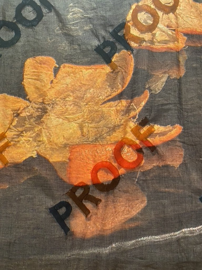
Hung in the center of the room were two photos that had been printed onto fabric; when you walk past, they will slightly dance in the breeze you’ve created. The first, “PROOF-Bedroom in Scarborough” appeared to be a photo of two people’s feet intertwined and poking out of the covers on a bed, then diagonally printed across the photo was the word PROOF, over and over and over again. Upon a closer look, the words PROOF had been painstakingly and perfectly embroidered over the fabric photo. The second hanging fabric photo was of a bright orange peel sitting on a dark table, also with PROOF embroidered all over it. What I found most exciting about this piece was how I felt a rush of different emotions and feelings that I couldn't articulate or figure out what they meant… I feel like there are so many layers to this work that I’m trying to understand; so here’s a potentially messy stream of consciousness so I can try and untangle my thread of thoughts. Each photo - detailing a soft, tender, caring moment - is printed onto slightly see-through fabric, which to me turns a photo, something characteristically opaque, hard, sharp, final, into something physically soft, moving, translucent - like a memory. Photos are memories in a sense, capturing something that happened, a moment in time. Having it printed on something that is translucent is obviously lending itself more truly towards a memory, as memories are soft and malleable. But then to have PROOF written all over the photos made me feel confused, like there was a degree of separation between these memories, like a jarring reminder that this photo is not for you; these are the proofs, they belong to the person who put the “watermark” there. But this isn’t just a watermark that was printed on top of the photo, this watermark was sewn on, I don’t know if it was handsewn or not but if it was then I can only imagine how much time it took the artist to do that. Which left me wondering, why? Why does anyone want to add a watermark to a photo, to avoid someone taking the photo as their own. If they were the ones in charge of adding the PROOF, who are they protecting the photo from? With so many questions, I turned to the incredibly thoughtful and thorough curatorial essay written by Dani Neira. They offered us, the viewer/reader, to consider where these works were positioned in the conversation of archive and queerness. How historically archiving objects in museums or galleries or archiving stories and facts in history books have disadvantaged and failed BIPOC and LGBTQ+ people, “dictating who or what is “worth” remembering”. I feel like artist Florence Yee is sharing these sweet, tender moments through the fabric photographs but then also protecting the image/object/moment from bureaucratic classification systems that do not have the best interests at heart for the BIPOC and queer artists who have made the work.

Beside the PROOF series was a sculpture created in collaboration by Florence Yee and Arezu Salamzadeh called Please Help Yourself. The piece was a ceramic orange peel; the citrusy remnants of delicately shared sweet segments. Food sculptures are nothing new and have become increasingly popular over recent years, but this did more for me than just whet my appetite because this wasn’t immortalizing something you could eat but rather the part you work at in order to get to the food inside and then the part you discard before digging into the bright orange treasure you’ve uncovered. There’s something special about eating an orange, the anticipation as you carefully remove the peel, potentially creating a unique shape as you unpeel and then, as if there could be a better food for sharing! Divided into adorable bite sized sections, perfect for handing to your friend or your love who’s nose perked up at the spritz of citrus when you initially dug your nail under the peel for the first time. I want to quote Neira’s curatorial essay again to give further context to Yee and Salamzadeh’s work: “[the] glazed ceramic tangerine peels draw in the Cantonese practice of offering tangerines as a way of welcoming guests into their homes. As a collaborative project during the pandemic, the artists mailed clay and instructions to friends and relatives, inviting them to “share a tangerine.” As the material of clay invites the imprint of the hands that mold it, the peels remain as traces of touch, care, and connection.”
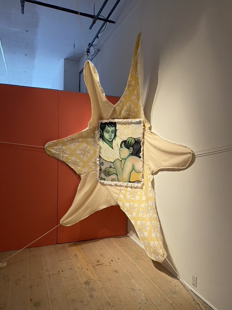
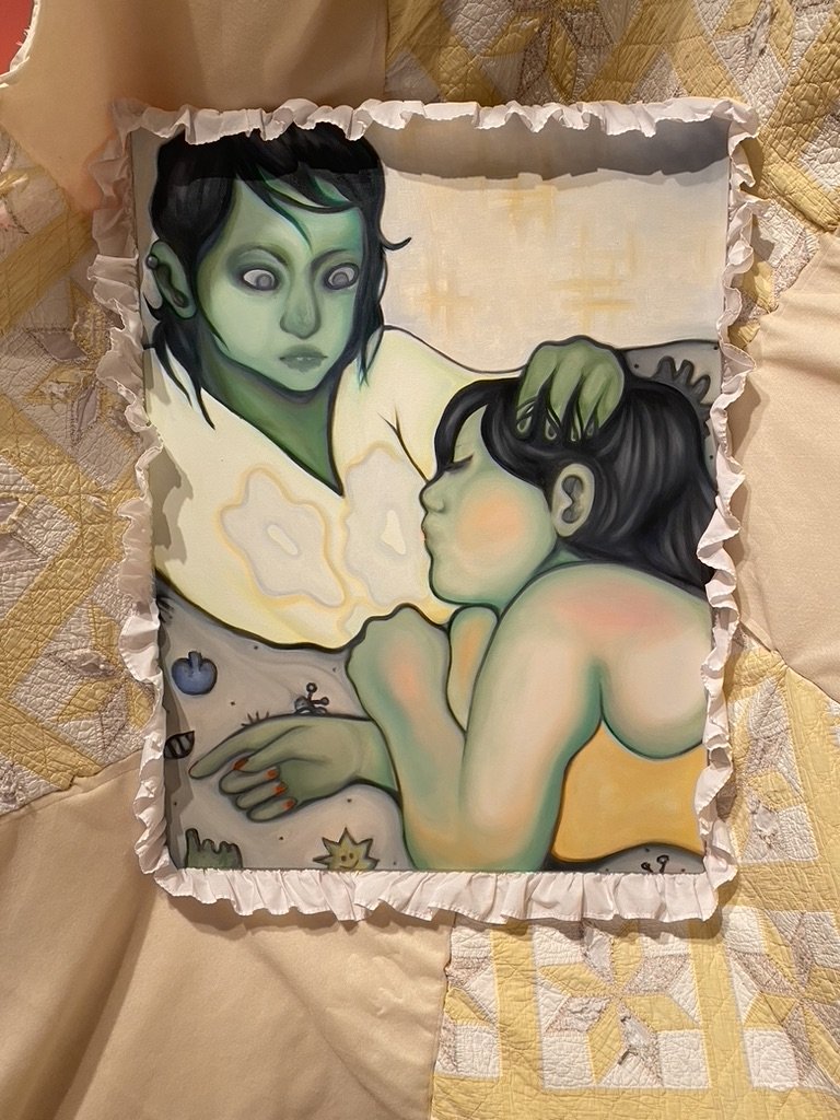
When I looked up from the ceramic orange peel, I think I might have audibly gasped. Beautifully lit, suspended by ropes and engulfed in a well-worn quilt is Cassia Powell’s most recent painting entitled comforter. I’m not writing about Powell’s work because I am a super fan or anything (although that is definitely true, and if you’re at all familiar with some of the videos, podcasts and support docs that J&J has put out you would probably come across their name), I’m writing about their work in this show because this is such a clear and exciting departure from their previous work that I want to make a note of. Powell is known for their use of sickeningly sweet saturated colours, usually a subject whose facial expression is showing clear anguish, and bright patterned backgrounds. What struck me first was how Powell utilized a more muted and limited colour palette, more greens and yellows. In the past the greens they used were more like a variety of sour candies whereas this time the greens were more in the range of mold growing on leftovers, forgotten and shoved in the back of the fridge. While previous paintings have been loud and in your face, this one was quiet, the outstretched yellow and white patchwork quilt invited you in, as if someone was trying to bring you in for a hug. When you stood close enough the quilt fills your periphery and it’s just you and this painting, you’re peering in at this tender moment between two people but the longer I look at it, I feel this duality: unease as I look at the ghostly stare of the first figure, but then a sense of safety as I look at the slightly glowing second figure cuddled up in the first figure’s lap. Comfort, stillness, peace, sadness but also the revolutionary act of care.
Even though I feel like I could just keep writing about this show forever, I don’t want to keep you reading forever!! So my final thoughts: I want to thank Dani for curating and creating such a thoughtful, safe, open and caring space for collaboration and community building. This was such a fresh, vibrant and inspiring show that made me eager to not only get into my studio but to get out into my community.
Queer Futurities: holding area runs until July 23rd at Open Space. If you are in the “Victoria” area before then, I highly recommend checking out this show!! xx